signed first edition
1984 · Purchase; Rochester
by Bernstein, Dennis & Warren Lehrer
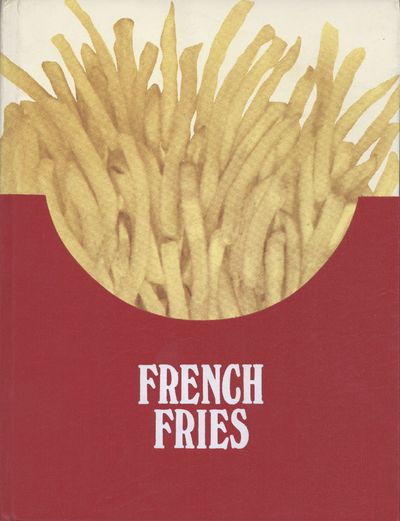
Purchase; Rochester: Ear/Say, Visual Studies Workshop, 1984. Quarto (27.5 x 21 cm.), 104 pages. Three colors on acid-free Mohawk Superfine. Color separation by Phil Zimmermann. Subtitle from second title page following copyright page. ~ FIRST EDITION; number 470 of 700 signed and numbered copies, with the signature of Warren Lehrer. An artist’s book rightfully considered to be a masterpiece of offset color lithography. Described by Johanna Drucker in The Century of Artists’ Books as, "a carnivalesque-pop-art amusement- motel-and-theme-park of visual and typographic devices." The authors state “French Fries is a quick service circus of culinary discourse, argument, dream, loss and twisted aspiration” (introduction). The project statement describes the work, "This book/play presents a day in the life of the original DREAM QUEEN restaurant (a restaurant that grew to become the third largest burger chain in the western hemisphere). Before the book/play begins, 83-year-old Gertie Greenbaum is found dead in a pool of blood and ketchup. Four customers and three employees (each set in his or her own typographic voice and color) give testimony to how Gerite died, and continue their day discussing food, money, religion, politics, love, loss, dreams, memories, and fading aspirations. The text is illuminated with icons and images that evoke the fast food tableau, and the internal projections of the characters." And others have commented, “Lehrer pioneered what might be best termed 'typographic performance' in his 1984 book/play French Fries, a hot type cacophony of word and image that is today considered by historians one of the lynchpins of the deconstructionist era…” (Steve Heller, Eye Magazine); “Without a discernable grid, the typography [in French Fries] flows freely across the pages, interspersed with images and marks evoking the ambiance and mood of the situation. Except for the work of the famous French designer Robert Massin, I had never seen an approach to typography quite like this before… I could experience the relationship between the text and its visualization, and I saw how effective it could be. Somewhere between seeing the books of Edward Rusha and Warren Lehrer’s French Fries, I discovered that my options as a graphic designer had expanded by tenfold” (Rudy Vandlans, Emigre Magazine, The Last Issue).
Clean and bright; lightest bit of rubbing to the white portion of the cloth. In original ketchup-resistant faux-leather cloth and die-cut over boards]. Very near fine. Scarce. (Inventory #: 9904)