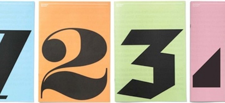
Two weeks ago, I was in York for the inaugural York Antiquarian Book Seminar (a British equivalent of the highly successful Colorado Antiquarian Book Seminar). The whole experience was hugely invigorating. Here were 25 students, young and old, starting out in the rare book trade, full of promise, eagerness— and questions!
One of the sessions I led was on cataloguing. For, as Roger Gaskell notes in his Terms of the Trade, "a large part of the trade in antiquarian books is conducted by catalogues, whether printed or online, and books offered in shops or at book fairs will usually be accompanied by a written description." It’s those printed catalogues I want to talk about today. Earlier this year, Lorne Bair, on this very blog, waxed eloquently on the benefits of producing printed catalogues, and I agree with him wholeheartedly. People often ask me about my printed catalogues (six to date), so I thought I would share something of their history here.
I set up on my own in January 2010, and right from the start I knew I wanted to do printed catalogues. I could have just sold books by e-mail, sending out PDF lists of what I have (and I do do that, too), but book collectors like books, physical objects that they can carry around, read on the bus, write comments on, mark by turning over the corner of a page. Because it is so easy now (and, of course, much cheaper) to create one’s own catalogues, in Word or whatever with a few scans dropped in, that is what many booksellers do, but the final product often looks homemade, with widows and orphans left dangling all over the place. As booksellers we really ought to know better, about what constitutes good book design. Producing a catalogue which jars the eye really doesn’t reflect well on what a bookseller knows about books.
I didn’t have very much money, but I wanted to get a catalogue out sooner rather than later, to show I was out there, an independent bookseller. So, what to do? I decided to focus on just 25 items, things I was pleased with. I had enough money for 25 interesting books, I thought, so would aim for that. I also considered that a customer might conceivably read a whole catalogue containing only 25 descriptions. In a catalogue containing hundreds of items, things are going to get overlooked. Obviously, one wants a catalogue to sell well. Choosing only 25 books for an entire catalogue might seem a high-risk strategy, but I was confident in the books I had selected for it and decided to push on.
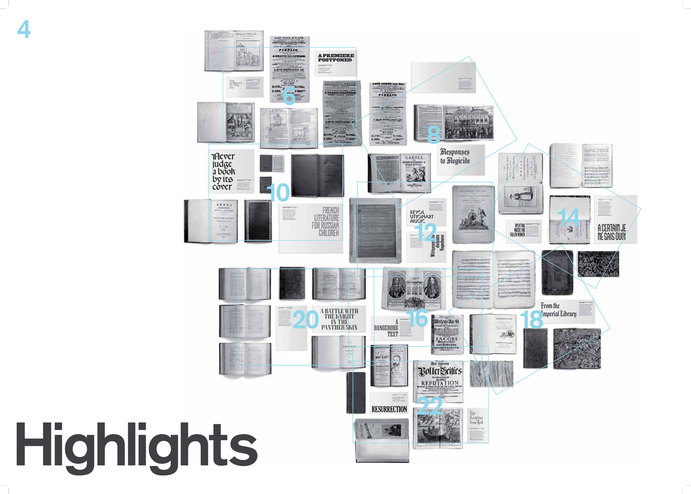
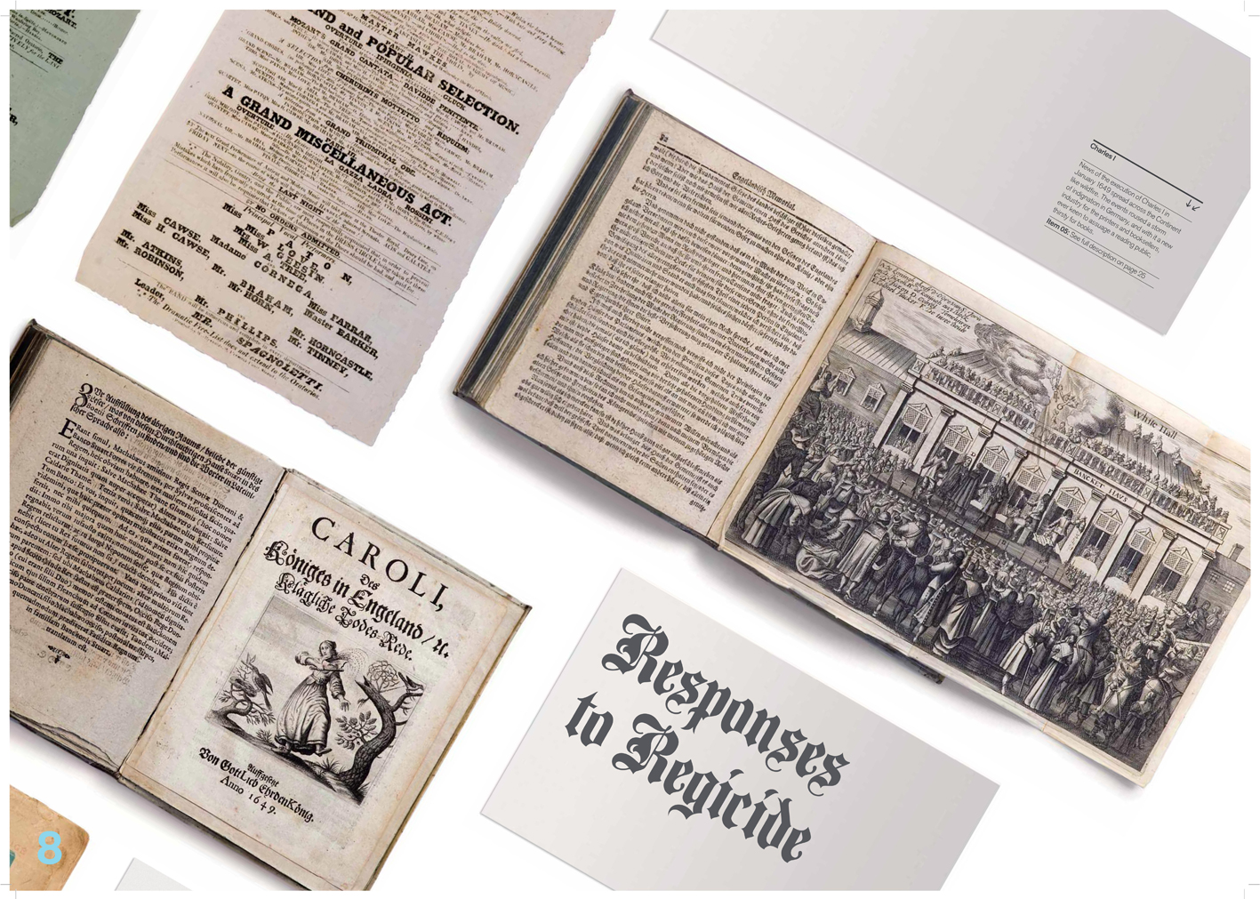
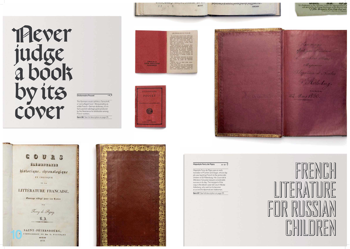
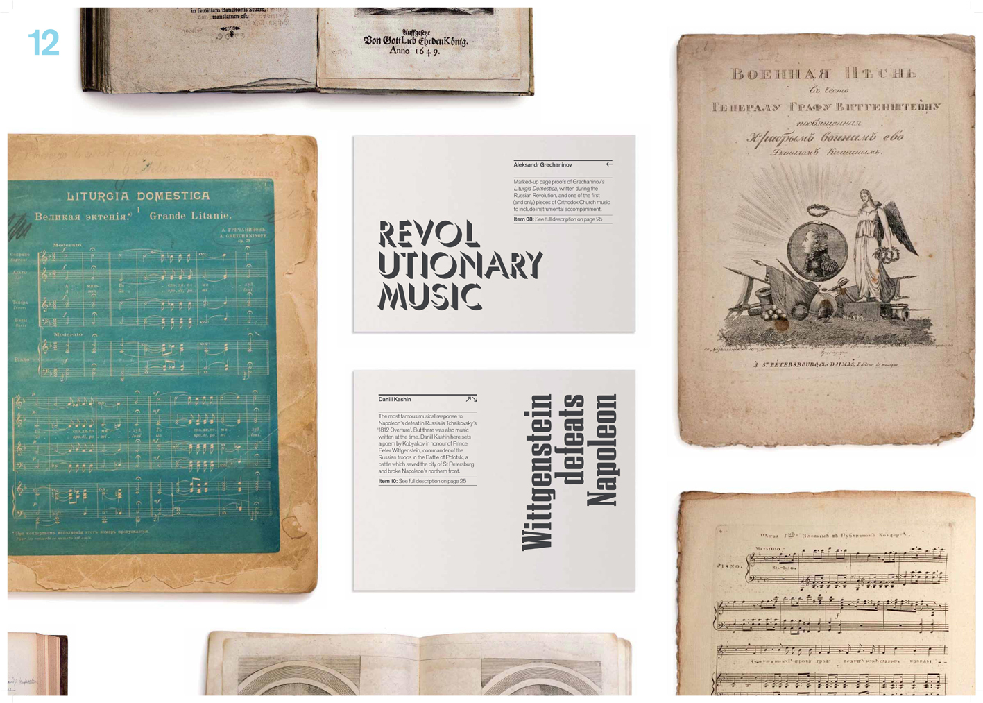
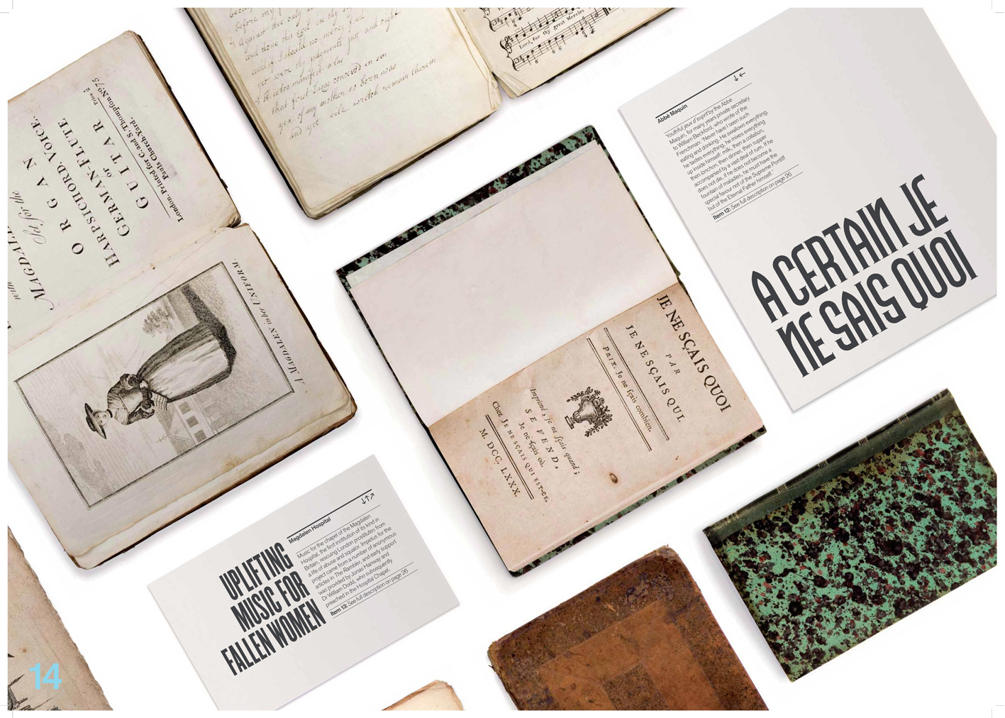
I wanted to do something different with these 25 books, a fresh approach. Booksellers’ catalogues haven’t really changed very much in the last 100 years. But book design has. Just look at some of the wonderful things produced by libraries (our customers, no less!) for exhibitions. And so the process began. I spoke to my good friend, the bookbinder Kathy Abbott, as I knew her husband ran a graphic design agency in London, called Purpose, and I liked their work. They had some big corporate clients, and I was rather concerned what the whole thing might cost, but I went and met them, showed them some other booksellers’ catalogues, and discussed what we might do to try and stand out. They were very excited by the whole project—presenting old books in a new way—and gave it to two of their then junior designers, the excellent Paul Felton and Amie Herriott, so they could get some experience liaising with a client etc. They had completely free rein as to the design, but obviously would work with me on finalising it. This was the result:


My catalogues are much larger than most others, measuring 16.5 x 23 inches when open. I liked the size. First, the pun on Short List (my title for the catalogues, defined by the dictionary as 'a list of selected candidates from which a final choice is made’), and second, having so much space to illustrate things properly.
It’s true, my catalogues take a little more time, and money, to produce, but I’ve had an overwhelmingly positive response to what I’m doing, from collectors, librarians, and fellow booksellers (and six design awards to date, from both sides of the Atlantic). I remember an e-mail from one librarian when Short List 2 came out (it was bright orange): "I don't know who your designer is, but it worked. Can I order item 17?" In fact, something which has driven me to maintaining the overall style and format is how commercially successful the catalogues have been: all have sold well over 90%.


